Tuesday, March 29, 2011

A Father Is A Light

Welcome back to my last guest design team Flourishes Timeless Tuesday challenge :( I don't know about you, but I've had the time of my life, this month!
This week Betty is challenging us to "Use Those Unused Stamps In Your Set". That was a bit of a challenge for me since I actually use pretty much every stamp in each of my sets, so I decided to use a set that I don't use often enough. 


 I used Flourishes "Sailing Away" set colored in with Tombows and cut out with a craft knife. The frame, from a Graphic 45 paper, intrigued me while I was at my LSS. Then I saw Becca's Pleated Background I really wanted to try it. The pearls are from Zva and the underlying pleated paper and old fashioned tag, are from other Graphic 45 papers.

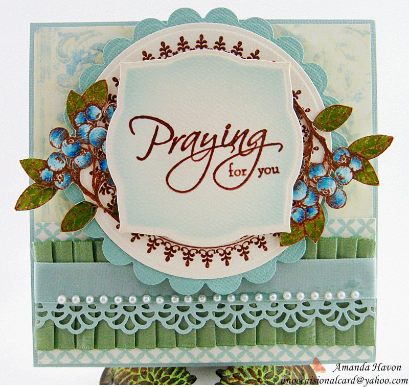
I cannot take credit for this card's pleated design, I saw Becca's (from AmazingPaperGrace.com) design and had to try it out, it was so pretty! I am a total fan of hers, since I found her blog, a year ago. I asked Becca for permission to use her design, and she, kindly said yes :) So all credit and honors go to Becca, who is so kind to this newbie card maker :) Thank you so much, Becca, you made this fan of yours, day, I'm so honored :) Please check out her blog, she has so many great cards and ideas, it's hard not to look and get inspired!

I have had so much fun and really enjoyed stretching my creative muscles with the Flourishes Design Team!! I would like to thank the amazing and incredibly talented Flourishes Team, for this wonderful and awesome opportunity. I am truly honored to have met and had fun with all of you. Everyone has been so amazing and nice :)
Now, I'm going to go enjoy the great eye candy on the rest of the Design Teams blogs :)

Sunday, March 27, 2011

Guess Who...?

Guess who just bit the bullet (and almost choked) and bought a bunch of the newest CHA Spellbinders? Seriously I almost had a heart attack, when it came to pay for these, but I love them! I bought the Spellbinders:

Labels 18
Labels 20
Labels 21
Fancy Tags #2
Fancy Tags #3

I really love them, and the next big purchase is the newest JustRite clings to go with the Label dies. I see everyone creating so many Beautiful cards with them, that I think they will enhance any one's cards and sentiments well.
So after playing around with them for a while I came up with this card.


I used a humming bird image and sentiment from Flourishes "Humming Along" set with a butterfly from Flourishes "Gerbera Daisies" set. I colored everything in with Tombows, and cut them out, adding some Donna Salazar glitter and placing them on top of popdots. I used Spellbinders Labels Eighteen (18) and two dies from Spellbinders Fancy Tags Two (2), sponging some "Worn Lipstick" Distress Ink around the sentiment. (I do want to mention that the Labels Eighteen base is actually a light pink piece of paper, same shade as the matting, but it has a metallic sheen so it makes it look whitish). I used papers from Chatterbox and a pink and brown sheet from Micheal's Crafts Store. The round accent stamp is from Inkadinkado with a strand of  pink bling rhinestones for an accent.
*Every new layer was placed on popdots for depth.


 I wanted to challenge myself to make a card with variations on the same color or shade. I ended up going with pink and I love how it turned out! And I am really loving these new Spellbinders! The shapes are fantastic and easily mixed with almost every other die! I'll admit, when Spellbinders first came out, I avoided them at first. I had Quickutz and couldn't see the reason for buying a whole new line of dies, especially when they would probably be too expensive to buy. LOL! I was so wrong!! Quickutz would only make alphabets and hardly any shapes, plus the alphabets they did make were twice, and in some cases, three times the cost of a package of Spellbinders!! I think they changed the card making industry for the better :)

Thursday, March 24, 2011

Praying For You

As you all know I love to make cards. I love the creating process and giving them away. Really, I generally I love everything about it, except for cards like today's card. 

My friend called and told me that someone we know in our church had miscarried. She asked if I would make a Sympathy card, for her. It's cards like these that I make with a heavy heart.


The sentiment I used is from Clear Dollar Stamps "Christian Sympathy" set is cut out with Spellbinders Labels 2. I sponged around the sentiment with "Tumbled Glass" & "Broken China" Distress Inks. I cutout blueberries, coloring them in with Tombows, from the Flourishes "Berry Sweet" set, placing them under the sentiment. The round decorative border stamp is from Inkadinkado, cut out with Spellbinders Circles and Scalloped Circles. The papers are from My Mind's Eye and K&CO. The ribbons are from my LSS (Local Scrapbooking Shop), the decorative edge is from the MFT "Faux Crochet Border" die, and the pearls are from Zva.


I'll be absolutely honest and say that I don't like making Sympathy cards. I feel pressure like they need to look perfect and have a great sentiment, to help connect with the grieving. But there aren't that many great Sympathy sentiments out there. I feel like every stamp sentiment I have seen is "cheesy", with the exception of this one. It's simple, to the point, and it's honestly what I am doing. I know what your going to say, it's not the look of the card that matters but the meaning behind giving it. I know and I agree. I don't mean to sound like it's all about me, it's not that. It's the fact that someone is going to receive this and hope that it gives a measure of comfort to them, but what if the sentiment just doesn't offer it? I always worry that the words are not comforting enough. Does anyone else think this way?

Tuesday, March 22, 2011

Grown With Love

Hello and Good morning everyone! It's time for my favorite day of the week again - Flourishes Timeless Tuesday! :) 
This week Makiko is challenging us to use "Masking" on our cards!
I thought this would be the best challenge for me since I couldn't think of anything, at first, and I was right. I love a good challenge that gets me thinking :)


I used a couple of Flourishes sets for this card: "Seeds of Friendship" and "Apple of My Eye". I colored everything in with Tombows and Distress Inks. I stamped them out together, then cut out and popped up the banner and apple image, for some dimension, on popdots. The papers are Cosmo Cricket and K&Co, the mini calender is from MME, and the flowers are from Prima, with a resin flower in the middle from MM. The edges are from a EK Success pinch, called "Dotted Swiss". The pearls are from Zva and I added a touch of stitching and lace ages with Glimmer Mist, to finish off the card.

 I really wanted to go with bold colors, just to mix it up a bit. When I dug through my stash, I found some really great rusty red papers and I knew they would be perfect. Honestly, sometimes I have no plan when I make cards I just play until it feels right, but that doesn't work for every one :)  Don't get discouraged on this challenge, I ended up making 3 cards, just to "get it right". You can do it! :)

I can't wait to see what the rest of the Flourishes Design Team came up with, I'm sure all their great ideas are sure to inspire you too! I'll see you next week for my last card of the month for Flourishes :)

Friday, March 18, 2011

Blog Fix in Progress :)

Don't panic folks, I somehow messed up my blog and it's currently being fixed! I tried adding a few new things to it but soon realized, once again, that I am not computer savvy. So I am enlisting a friend to help me out. I'll be right as rain soon....I hope! So bear with me until we can get it back online- LOL :)

Tuesday, March 15, 2011

Butterfly Happiness

Good Morning, it's time for another Flourishes Timeless Tuesday challenge! Are you having as much fun as I have been, with the past couple of challenges? The Flourishes Design Team really know how to stretch your imagination :)

This week Silke is challenging us to use "Butterflies" in our creations! I love, love butterflies and if you do too, this is a wonderful time to use your butterfly stamps! :)


I used butterflies from Flourishes "Clematis and Butterflies" set and a sentiment from their "Waterlily"stamp set. The butterflies are colored in with Tombows, cut out and popped up with popdots under them for "lift". I also folded their wings up so it would look like they are in flight. The "frame" was cut out with the largest Spellbinder "Lacy Square" die to achieve the scalloped opening. I used a Spellbinder "Circle" die to create the center, placed over a "Scalloped Circle" with a few "Fancy Tags" arranged under it, all placed on top of a new Spellbinders "Window Die"under everything. I lightly sponged "Worn Lipstick" Distress Ink around, for some extra color. The pearls are from Basic Grey, placed all around the card.


I have to say that this was a fun challenge and I loved every second of creating this card! I had an idea of placing some butterflies around in a circle, for a long time, and this challenge was perfect to try it out :) I painted the butterflies in before I found the papers that I wanted to use, so I was lucky these worked out! LOL! :) Thank you, Silke, for a fun challenge! :)
I'm off to see what the Flourishes DT members have made with butterflies this week, I can't wait! Good luck and have fun! I'll see you next Tuesday for another Flourishes TT challenge :)

Saturday, March 12, 2011

Thankful For Butterflies

Have you ever had an idea, for a card, that you wanted to try? I have always wanted to make a frame of flowers all around a card, but I had to find the right stamp images for this. So I was looking through my stamp stash, and saw my Flourishes "Clematis and Butterflies" set, and it was like "that's the set!" :)


I used Flourishes "Clematis and Butterflies" stamp set colored in with Tombows. I cut the flowers and butterflies out and popped them up on popdots. The paper is from Melissa Frances, cut down to a 7x7 size.


I love Monarch butterflies, and although they are hard to spot in my card, I rather like them being hidden and kinda tucked into tiny spots. I kept the light low so you can see the edges of the card better, but in real light it's pretty. I love how it turned out and I might give it a try again with a different set :) I love how versatile Flourishes Stamps are!

Tuesday, March 8, 2011

Let's Have Tea

Good Morning, it's time for a Flourishes Timeless Tuesday challenge to wake us all up! Trust me, it's better then coffee, these challenges :)

Today Cindy Haffner is challenging us to use "Stitching".
I'll let you in on a secret, sewing machines and I just don't get along very well, so I kept my sewing clean and simple.


I used Flourishes "Lets Have Tea" set, colored in with Tombows and cut out the "negative" spaces with a craft knife, and popped it up on popdots. After sewing around my card, I added a "Carte Postal" postcard sticker, a flourishes transparency from MME, and some bling from Zva. The paper is Graphic 45 and Melissa Frances. I added Flourishes Maya Arts "Champagne" ribbon with a hat pin, to finish it off.


When I have tea, I think of nostalgic times and handwritten letters. Since March is national letter writing and correspondence month, I added those elements to my card. Handwritten letters are a treasure and I still have all of the correspondence letters my husband and I wrote to each other while dating :)

Even though I am still kinda new to sewing on my cards, I am really in love with how it looks. Thank you for the challenge, Cindy, I'm going to try to incorporate it onto my cards more often! But now, I am going to check the rest of the Flourishes DT creations and get more ideas :) I'll see you next week for another Flourishes Timeless Tuesday challenge :)

Tuesday, March 1, 2011

Once Upon A Springtime...

I have some exciting news to share with you!!! My favorite stamp company, Flourishes, asked if I wanted to be Flourishes Timeless Tuesday Guest Designer for March!! I am so thrilled and honored, you have no idea!! :)


Today Dee Jackson has challenged us to "Make a St. Patrick's Day card or use Green". A fun springy challenge,  don't you think? :)
 I started making this card having one direction, in mind and ended up with a completely different card. I was inspired by one of Barbara Anders cards made with the new "From the Desk Of" set from Flourishes. It has some beautiful details and layering and that's what I loved about it.


 I used Flourishes "Humming Along" set, colored in with Tombows, cut out with a craft knife and popped up on foam popdots. I used some new Graphic 45 paper, K&CO paper, pearls from Kaisercraft, and a beautiful silk "Moss Olive" ribbon from Flourishes for the finishing touch.


I love the little banner across the bottom and the looped string of pearls around it. I let them "stand up" and not lie flat to keep it looking interesting and not one dimensional.
I really enjoy spring but it has been so cold here, even for the desert, that this was a great way to invoke thoughts of spring until it arrives :)
I want to thank Flourishes and the Flourishes DT for this wonderful opportunity to participate with them and have some fun along the way :)
Well, I'm off to check out the rest of the Flourishes DT Creations!! And I'll see you next week for another Flourishes Timeless Tuesday Challenge! :)